ReviveKit case study
Brand Identity, Packaging, Web, Launch by Evolve Branding, Vancouver.
Services
- Brand Identity
- Packaging
- Web
- Launch
Products
Built the brand and launch system for ReviveKit, a wellness and recovery kit designed for active lifestyles.
revivekit.comReviveKit is a modern muscle recovery and mobility brand built for the wide middle of the active market, everyday runners, weekend athletes, desk-bound office workers with cranky shoulders. Evolve built the name, the brand, the packaging system, and the direct-to-consumer platform for a product line combining foam rollers, percussion massage devices, targeted supplements, and mobility protocols.
Recovery is a category polarized between two extremes: elite athletic branding (aggressive, dark, performance-obsessed) and clinical wellness (sterile, medical, joyless). Neither speaks to the person the category is actually built for, someone who wants to feel less sore tomorrow, not someone chasing a marathon PR. The brand needed to occupy a warmer, more approachable middle without losing the credibility that makes people trust a product with their body.
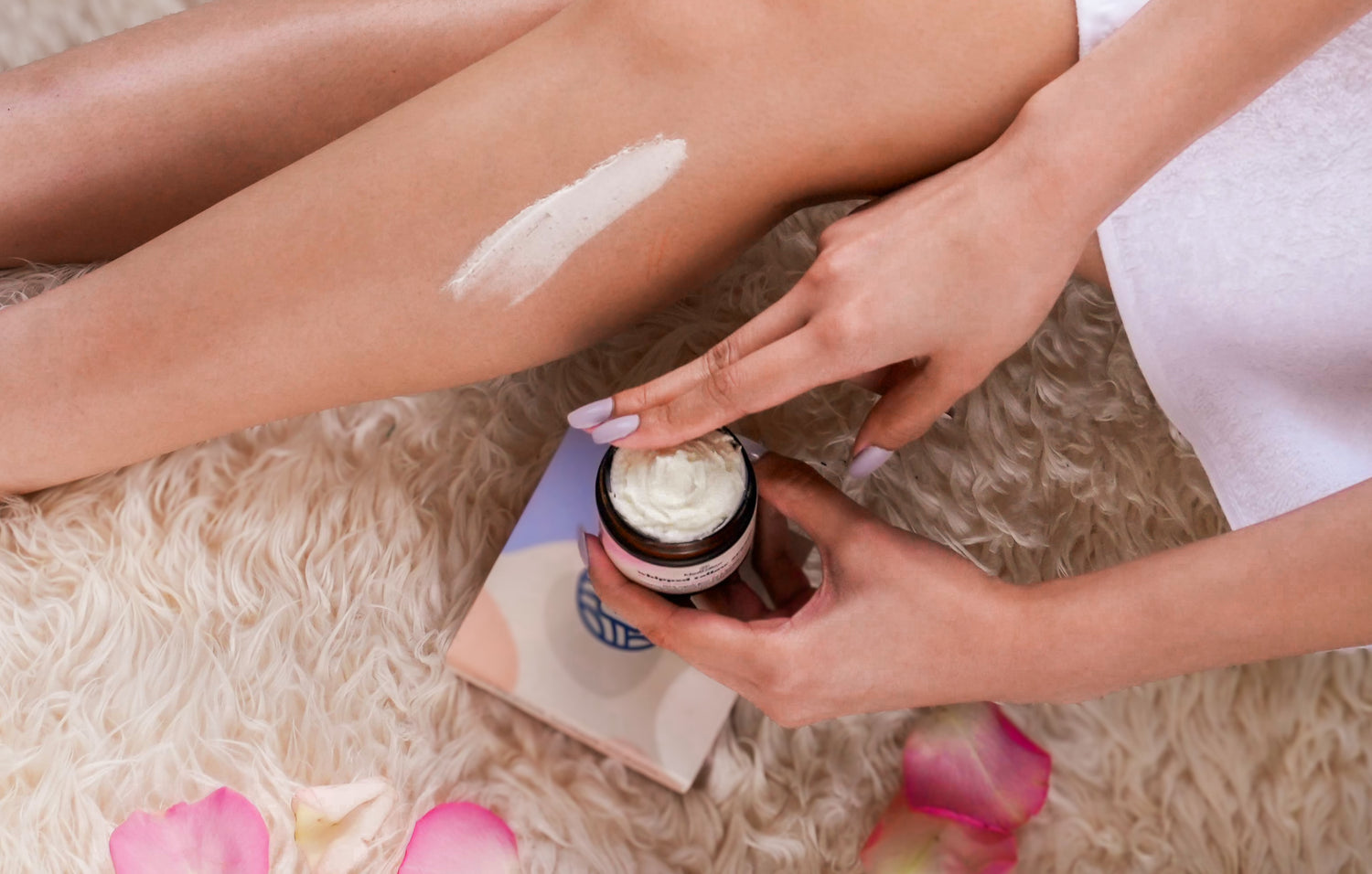
We positioned ReviveKit on 'recovery for regular people', a promise that the products, packaging, and copy all have to earn. Identity leans on a warm neutral palette with a single vitality accent, clean geometric typography, and photography that shows real bodies in ordinary spaces rather than heroic gym compositions. Packaging is designed to look at home on a bathroom shelf, a home-office desk, or a gym bag, not just one of them. The e-commerce platform is built around bundled kits (Runner's Kit, Desk Kit, Post-Workout Kit) rather than a raw SKU grid, so the first-time buyer's journey is 'what's my situation' rather than 'which SKU do I need.'
ReviveKit launched with a full identity system, packaging line, and DTC storefront ready for paid acquisition. Kit-first merchandising lifted average order value materially above the raw-SKU baseline the founders had modelled against, and the brand has since expanded into new recovery devices and a subscription program.
Deliverables
- , Naming + verbal identity
- , Full visual identity system
- , Packaging line (multi-format)
- , E-commerce site design + build
- , Kit merchandising architecture
- , Product photography direction
- , Launch marketing playbook
The kit
Bundled kits over raw SKUs, because most people don't know which supplement they need, they know how they feel.
Recovery for regular people
Photography that shows real bodies in ordinary spaces, a kitchen stretch after a run, a lunch-hour reset before an afternoon of meetings.
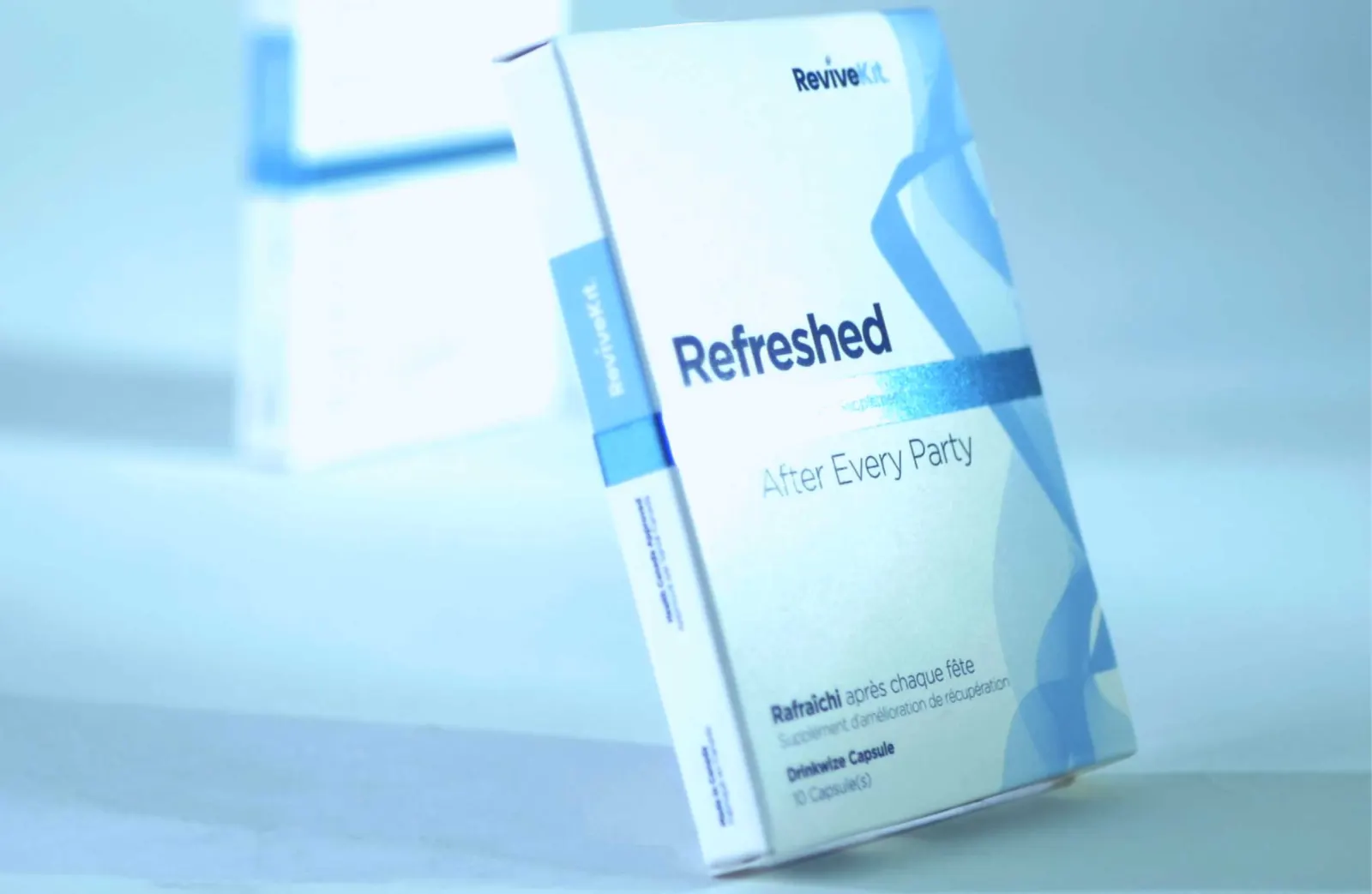
Evolve was contacted by ReviveKit owner Tony Jang in 2015. The concept was to create a hangover relief supplement, that was contained in a simple capsule. We rebranded ReviveKit to appear more calming, peaceful and modern.
Hangovers suck. ReviveKit is a hydrating capsule using Milk Thistle, Ginger Roots, Indian Gooseberry, and dietary vitamins to supplement the liver. This helps protect the internal organs that are responsible for hydration, control of nausea and other unpleasant side effects from drinking alcohol.
Evolve produced a remarkable brand visual identity system for ReviveKit. We consulted on print styling, paper texture, metallic colour swatch, and also which printer would provide the best cost, value and benefits to the organization.
We specialize in metallic print consultation and the paper stock needed to have the right feel. The ReviveKit brand required a custom blue ink, developed by Glenmore Printing.
Experience with the Big Brands.
Brad Sherwin led brand and launch work for ReviveKit.
Recovery, Reimagined
When launching a national campaign ReviveKit needed to feel clinical enough to trust and human enough to love. Our system balanced medical-grade clarity with warm, confident voice so the product can scale across retail and DTC.