Services

Brand Visual Identity
Mission Statement
Web Design
UI/UX Design
Film Production
Web Development
Proposal Development

Company

Established in 1970, Dowco’s history, heritage, and ongoing success can be explained simply – at the Dowco Group they believe in our services and products. As one of the world’s largest steel detailers, the company has built with the following brands: Google, Amazon, NASA, One World Trade Center, Bill and Melinda Gates Foundation, Mercedes-Benz, and many others.

Repositioning for the next 50 years.

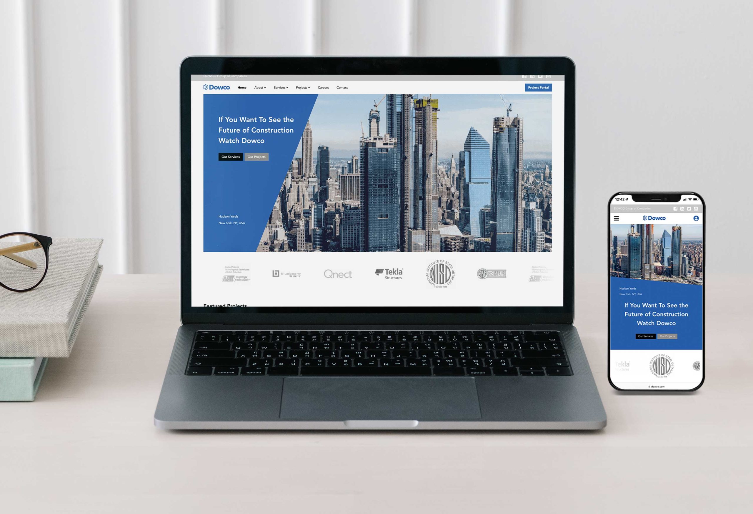
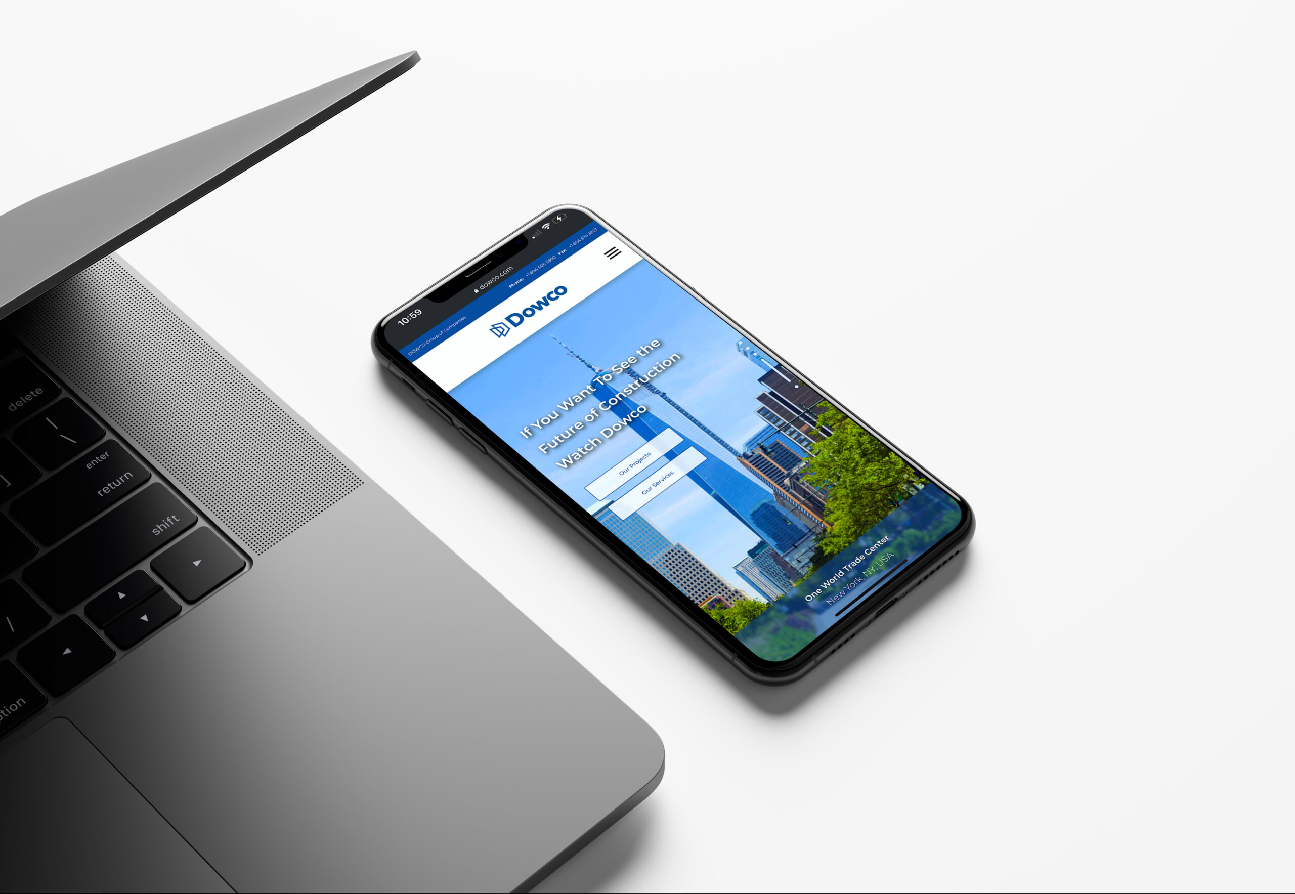
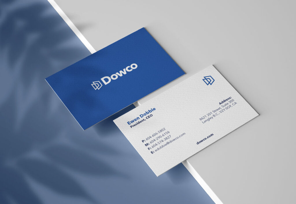
Dowco required a new look and feel, and a new brand heartbeat. We started at the core, researching the companies history since it’s inception in the 70’s. Hundreds of collective hours were poured into understanding what made the company special, and what truly made the brand different against the competition. It was the innovative spirit of each and every staff member. There was no culture… There was a spirit. And this shone in each and every one of Dowco’s unique solutions to incredibly complex challenges. ‘Some say it can’t be done, we think differently.’ Their tagline said it all, and we slightly repositioned the tag to say ‘If you want to see the future of construction, watch Dowco.’

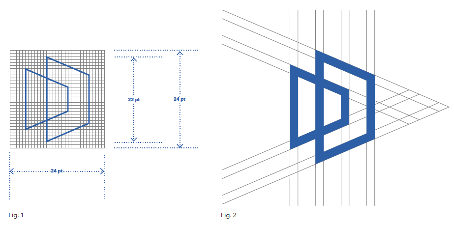
The Dowco icon was developed within a grid system that must always be present in the representation of the brand. The logo below, (‘Fig. 1’) design grid showcases the grid, and the dimensions of the mark.

The second figure (‘Fig. 2’) shows the grid lines and foundation of the perspective lines. It is critical to use the exact angularity in all representations of the logo.

Icon Rationale

The iconography for Dowco takes inspiration from the complex building information models and architecture that Dowco has worked on. A key to the brand visual identity, within the icon, is the forward movement and direction of the company. With the next 50 years in mind, the icon was developed to represent progressive, perpetual movement in the industry, and within the technologies that help build world. 3-Dimensional space is represented within the icon, which was developed with horizon points of reference.

Finally, the icon represents the founders; the Dobbie name, found within the essence of the brand. The abstract representation is too abstract for the average viewer to recognize, but represents a strong tie into the historical innovative nature of the founding family.

Typography

The Dowco primary font is Avenir Next World. Chosen specifically for its legibility from afar, modern appeal, and technical appearance.

The original Avenir typeface was designed by Adrian Frutiger in 1988, after years of having an interest in sans serif typefaces. The word Avenir means “future” in French and hints that the typeface owes some of its interpretation to Futura. But unlike Futura, Avenir is not purely geometric; it has vertical strokes that are thicker than the horizontals, an “o” that is not a perfect circle, and shortened ascenders. These nuances aid in legibility and give Avenir a harmonious and sensible appearance for both texts and headlines.

In 2012, Akira Kobayashi worked alongside Avenir’s esteemed creator Adrian Frutiger to bring Avenir Next to life, as a new take on the classic Avenir. The goal of the project was to take a beautifully designed sans and update it so that its technical standards surpass the status quo, leaving us with a truly superior sans family.

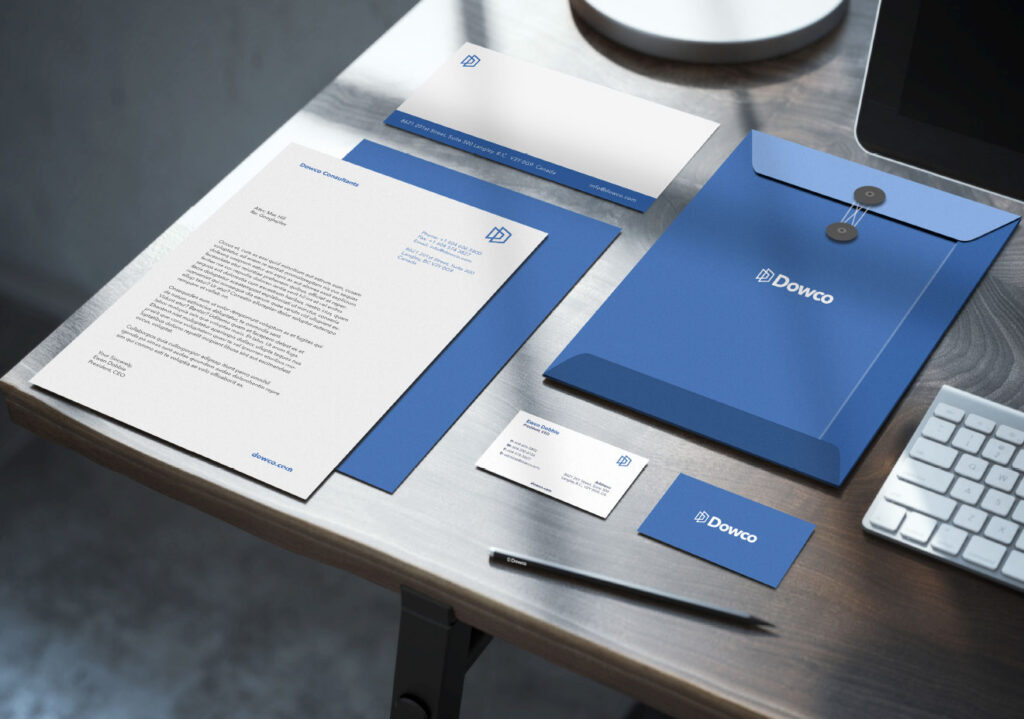
With this thinking, we remastered the Dowco brand identity.

Want a proposal?

We Make custom proposals, please make a RFP (request for proposal) to get us started on yours.

We carefully monitor, analyze, audit and optimize by starting with research. Then we are able to start developing numbers and project budgetary outlines. It begins with a strong discovery session, commonly referred to as ‘a brief.’